-
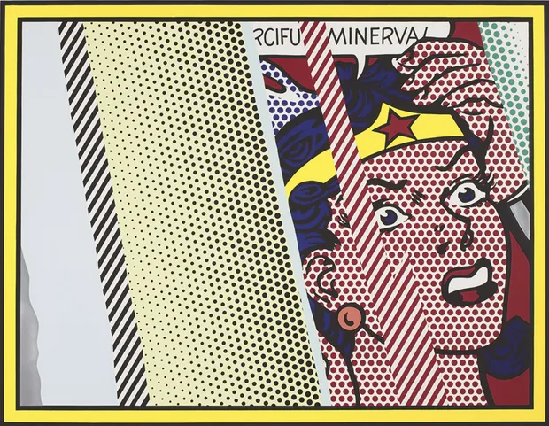
 Reflections on Minerva, 1990Lithograph, screenprint, relief, and metalized PVC collage with embossing on mold-made Somerset paperSheet: 42 x 51 3/4 in. (106.7 x 131.4 cm), Edition of 68; plus 16 AP, 1 RTP, 1 PPI, 1 PPII, 1 A, 1 C©The Estate of Roy Lichtenstein
 -
"Use the worst colour you can find in each place - it usually is the best."
- Roy LichtensteinIn the Reflections series, Roy Lichtenstein intensified his use of bold, high-contrast colour to heighten both drama and distortion. Saturated reds, yellows and blues are set against stark black outlines and fields of Ben-Day dots, creating sharp visual tension between figure and ground. These vivid Pop colours are then interrupted by metallic and grey reflective bands, which simulate glare and fracture the composition. The result is a dynamic interplay between flat, graphic colour and shifting optical effects, reinforcing the series’ focus on illusion, mediation and surface.