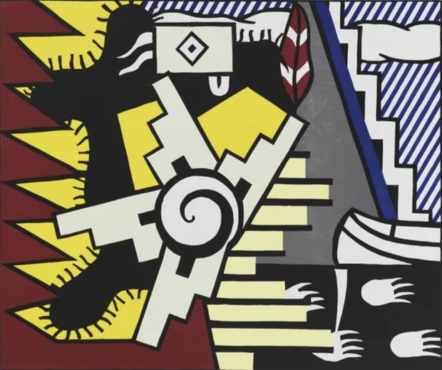
AMERICAN INDIAN THEME II, 1980: Woodcut on paper by Roy Lichtenstein

  • American Indian Theme II, 1980 is a print by the artist Roy Lichtenstein showcasing the variety of colour, pattern and shapes in tradtional native american artwork.
    American Indian Theme II, 1980
    Woodcut on handmade Suzuki paper, sheet: 82.6 x 95.3 cm (irregular)
    Edition of 50; plus 18 AP, 1 RTP, 1 PPI, 1 A, 1 C (and 1 teaching-aide proof)
    ©The Estate of Roy Lichtenstein
     
    BACK TO: AMERICAN INDIAN THEME SERIES


    Lichtenstein’s American Indian Theme II, 1980, brings together a dynamic arrangement of bold shapes and colours to create a visually complex composition. The image draws on patterns and motifs associated with Indigenous decorative traditions, reinterpreted through Lichtenstein’s graphic Pop Art style. Along the left side of the composition, a deep red form with a jagged, spiked edge frames the image, while areas of bright yellow sit behind a large black shape from which short black lines radiate outward. At the centre, a cream coloured geometric structure with stepped edges extends from a black spiral form, creating a striking focal point within the composition.
     
    The right side of the print introduces additional patterns and contrasting shapes. A blue and white striped background is intersected by a series of graphic elements, including zigzag stair like forms and a cloud shaped motif rendered in white. These layered shapes create a sense of visual movement across the surface of the image. Created as a woodcut on handmade paper, American Indian Theme II forms part of Lichtenstein’s American Indian Theme series from 1980. In these works, the artist reinterprets recognisable cultural motifs through flat colour, geometric structure, and the bold graphic language that characterises his Pop Art practice.
  • "I don't make any distinction between the art I make and the commercial art."


    - Roy Lichtenstein

    Lichtenstein’s use of colour, shape, and texture in American Indian Theme II enhances the bold graphic quality of the composition. Strong contrasts between red, yellow, and blue create visual clarity, while geometric shapes and repeated lines give the image a structured rhythm. The woodcut process also introduces subtle surface texture, adding depth to the flat colour fields and reinforcing the print’s striking visual impact.